
Napkin sketches, literally.
When our friends at REUNION CREATIVE reached out about updating their logo, we were excited to jump in. Working with other creatives is one of our favorites things.
The best part? They pretty much knew what they wanted. They just needed some help turning some napkin sketches into tidy vector images, with all the fine details nudged into place.

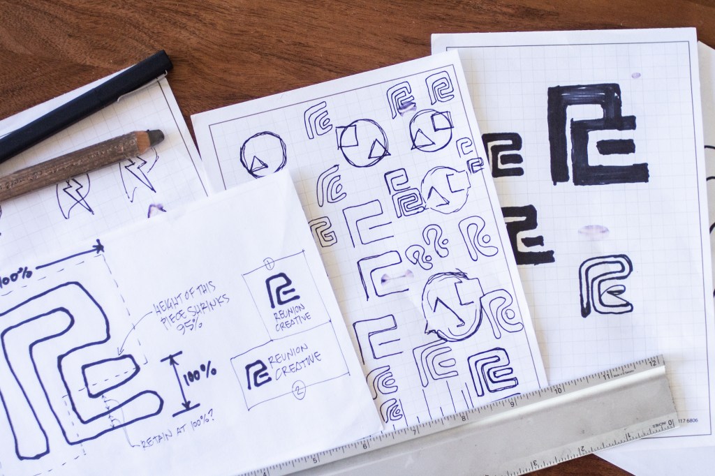
REUNION is a full-service design and fabrication shop with a specialty in one-of-a-kind metal and woodworking projects. The nature of their work celebrates the elegance in custom forms, and their new logo evokes this by breaking away from a rigid layout and embracing something that feels hand-crafted.
After a quick design-centric call, Goforaloop put together a set of variations of the logo sketches, with options that spanned from geometric to playful. A few rounds of tweaks landed the logo in a great place, bringing a familiar feel to the logo.

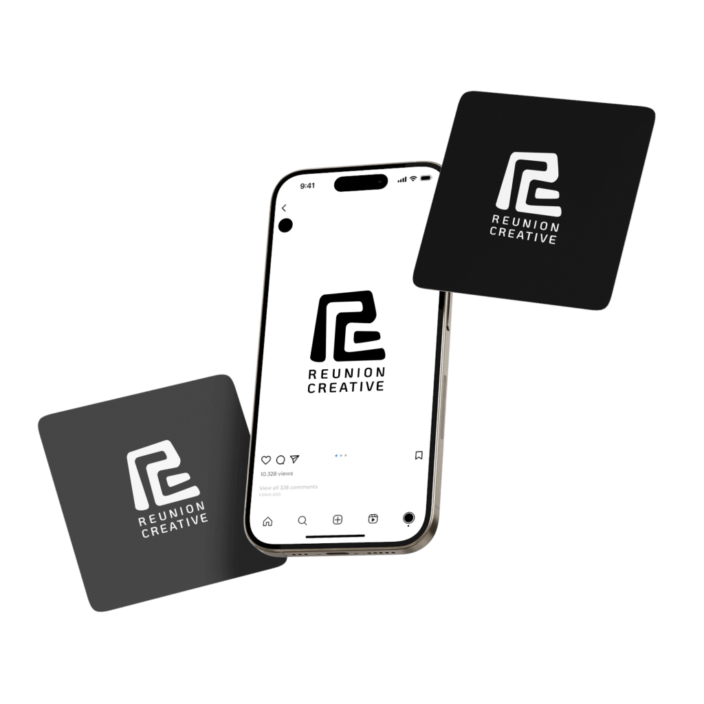
We rounded out the work by customizing a typeface for the wordmark. We carried the organic rounding of sharp corners into the design of the letters to continue the theme.
Once the design was locked, we built vertical and horizontal layouts for different use cases, and delivered a final logo package with vector files, scaled PNGs (with and without alpha layers), and project files.
Looking for help on your next project?
